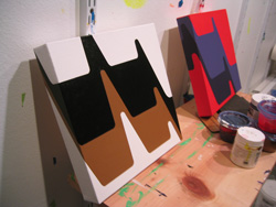
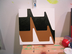
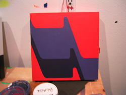
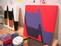
Over the weekend I finished the first two studies for a new line of paintings. These are just 10 inches square, a good size for demonstrating a proof of concept and getting colors straight.
 |
 |
|
 |
 |
|
I plan on exploring this design quite a bit more over the next few days … I’m fascinated with its undulating shapes, and I’m trying to see what will come about by varying the shapes and colors. Just testing out ideas on a small scale before I start producing larger work again.
This design and others are the disembodied byproduct of mining corporate logos from the 1960s and 1970s, looking for hidden angles, spinning their shapes, flipping and combining them.
It’s all a bit like dragging a needle backward down the grooves of a vintage record. Like Black Sabbath’s Master of Reality? Or maybe the original score for A Clockwork Orange.
There’s nothing nostalgic about this … there just was a design sensibility at work back then … the shapes were bolder … fewer gradients. A strangeness about the flatness and geometric rigidity, in my opinion.
Otherwise, I’ve been listening to The Coral’s most recent album … the at-times-haunting, mysterious Invisible Invasion … and I can’t wait to hear the new album that’s coming out August 6, Roots & Echoes.
Anyway, I hope to upload a new batch of sketches soon, probably by the end of the week, as some time frees up.
Tags: in the studio, minimalism, paintings


Really like where this series is heading professor Wiggins! Love the red one especially. Thats not Flouro red is it? It looks cadmiumish.
Is that you, Oliver Hibbert? Splendid! Thank you for the post. The red does have some fluoro red in it. It’s a mutt red … like most of my colors … cadmium red w/ cadmium red light w/ fluoro red (just for the visual bounce factor) w/ 3 or 4 drops of white.