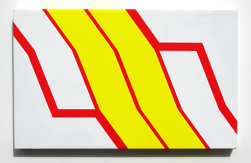
Last week’s production included two paintings (10 x 16 inch, or 25.4 x 40.6 cm) studies inspired by the SEPTA logo.

I’ve posted both to flickr. Above is Spectral 2, which seems to me a bit packaging-inspired, even though that’s not the case. Midway into making it, I decided not to flood the perimeter of the canvas with red; instead, the red merely outlines the yellow and white stripes. So perhaps I will begin to pursue a middle-ground between minimal design and graphic design, voyaging back into packaging-inspired works. I feel as if I have been searching for a combination … and I know the floodgates will open when I discover it.
In other news:
• I think I’ve devised the perfect bright red, which has the most intense luminosity of bright red ink. It’s one part naphthol red light, one part fluorescent red. The result is excellent, although it requires six coats. This color lacks the overt fluorescence of fluorescent red, and is more opaque. Completely eye-popping!
• I enjoyed reading this article about Sol LeWitt at Mass MoCA, in yesterday’s New York Times
• I found the Julian Schnabel interview on 60 Minutes compelling last night. Schnabel utterly lost it when Morley Safer breathed mention of critic Robert Hughes. His reaction was visceral. See for yourself here. My take-away was this: If you care that much about what others write and say about your art, you’re probably making art for the wrong reasons. It’s hard to see someone get wound up by a critic. Focus on making the art instead. Make art for yourself. That should be reward in itself. To hell with the rest.
Tags: minimalism, pop art


= Black Flag + Shell
Nice, Blob. That’s exactly what I was thinking. Actually, I thought you’d bring up the universality of ketchup & mustard colors in fast food logos.
It’s clearly a close-up of the torso of dancing bacon.