“I am not fond of white,” Verner Panton wrote in Lidt om Farver (Notes on Colour). “The world would be a more beautiful place without it. There should be a tax on white paint.”
Lately I’ve been reading about Panton—his retrospective book published by the Vitra Design Museum, as well as the aforementioned volume—and I am utterly blown away by how Panton throws himself into using color, and even develops his own color system (in partnership with Mira-X, throughout the 1970s).
Since it is so awash in color, Panton’s color method has inspired me rethink my praxis of — or reliance upon, or addiction to—using white. Looked upon in one way, the selection of white over another color virtually represents a lost opportunity to inject a work with more depth and vibrancy.
For quite some time, I have viewed white as a symbol of purity—a manifestation, or return to, something’s original state. (Perhaps this is a result of being overexposed to cleaning-product ads since birth?) It affords guaranteed negative space in a composition. Further, placed against fluorescent colors, it can make a fluoro red or orange “pop” completely. And it pairs perfectly with black.
Having explored the life’s work of Panton for the past month, however, I’m seeing how white also can be viewed as offering nothing to the visual conversation. It is a “nothing.”
“It saddens me that so many people do not understand that colours are a dimension which can add to the experience,” Panton wrote elsewhere in Notes on Colour. “There is an incredible number of people who fight against the use of colors—but there are also many people who fight against common sense.”
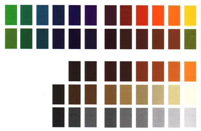
While this line of argument has streamed through my mind, I have been mesmerized by the color charts in Panton’s Mira-X color system. I’ve scanned them from the Vitra volume for you here. The first is Panton’s “version 2” Mira-X system (12 original colors, plus 36 new colors, black and white). Below that is an expanded “version 3” system, (36 additional colors; a total of 86).


I’m truly half-tempted to try to create a color system of my own. Pre-mix all of my paints ahead of time, and rely on those. I suppose it would have a host of fluorescent hues!
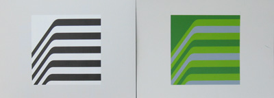
In other news: Below are two works on paper I produced over the weekend. These reflect a “Version 2” design of Civvik. The curves are slightly more angular than the original. Again, because they are works on paper, they are experiments. Whether or not I get them “right” is not a consideration. I am merely making.

In closing, the inauguration of President Obama today culminates a remarkable change of spirit within our culture. The way I feel is this: If you don’t get it, you just don’t get it, period.
Tags: color theory, verner panton


Thank you for the blog concerning a charismatic person! More information about Verner Panton – his life and work – is postet at: blog.verner-panton.de.